ReportIn: Product Redesign
Company
DiveIn Media
Year
2026
ReportIn is an influencer marketing platform connecting brands with agencies and creators. When a brand receives an agency-curated list of creators for a campaign, they must review each profile — checking stats, evaluating proposed costs, and deciding to accept, reject, or negotiate — before submitting a final shortlist. I conducted a full UX audit of this critical workflow, identified ten issues across four severity tiers, and redesigned the campaign workflow end-to-end: from the creator shortlisting screen through to final submission.
Scope of Work
Context & Problem Space
The shortlisting workflow: The page under review was the campaign review screen — where a brand marketing contact reviews a curated list of creators proposed by their agency and makes individual decisions on each: select, reject, or counter-offer a different cost. This is one of the most consequential screens in the platform. A poor decision here — an accidental reject, a misunderstood counter-offer, an abandoned session — directly affects campaign outcomes and agency trust.
The interaction was designed per-card, not for the actual job of making multiple decisions in sequence on a mobile device. There was no persistent progress indicator, no bulk action capability, and the single input that enabled cost negotiation was ambiguous enough to cause real user hesitation and abandonment.
Design Challenge
How do we help a time-pressed brand marketing contact confidently review multiple creator profiles, negotiate costs without ambiguity, and submit a complete shortlist — entirely on mobile?
Research & Discovery
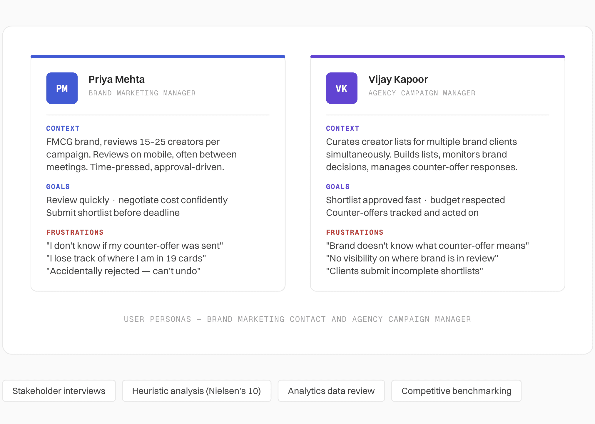
Who uses this screen: Two distinct users interact with the shortlisting flow, with very different mental models and goals. The redesign had to serve both simultaneously — the brand contact making decisions, and the agency manager tracking those decisions.
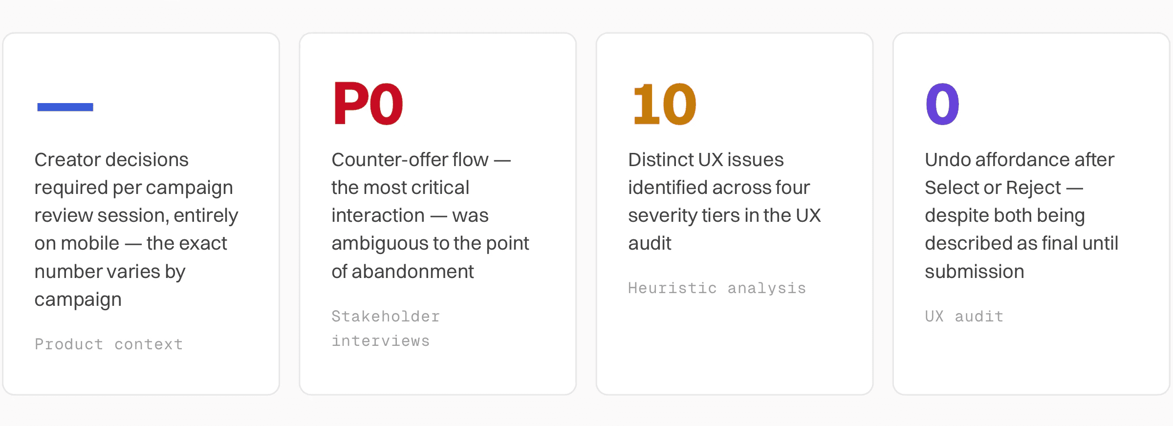
Key findings from research
UX Audit
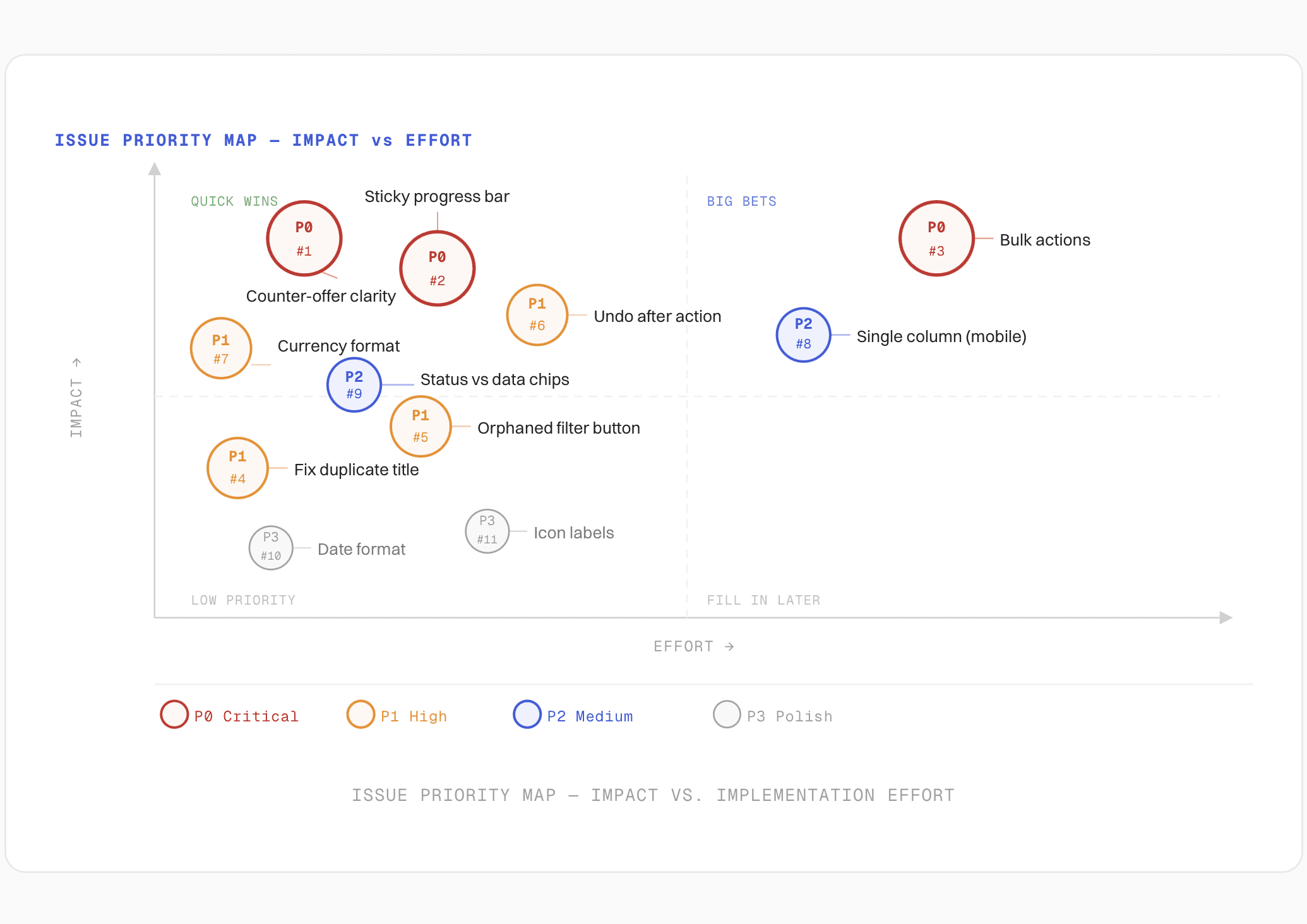
Issues identified (by severity): The audit identified ten issues across four priority tiers. Three were critical (P0) — they directly blocked or misled users on the primary task. Four were high priority (P1), impacting completion quality. The remaining three were medium and polish issues.
Critical Issues [P0]
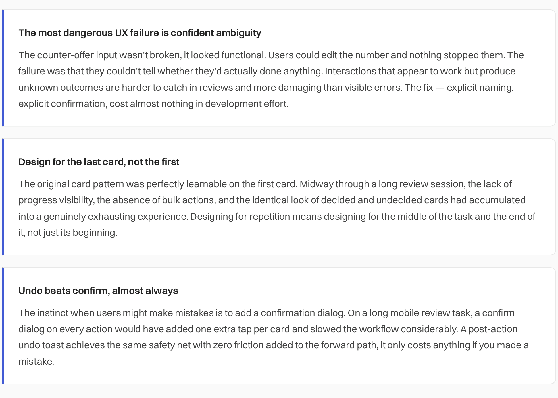
#1 - Cost Input Ambiguity
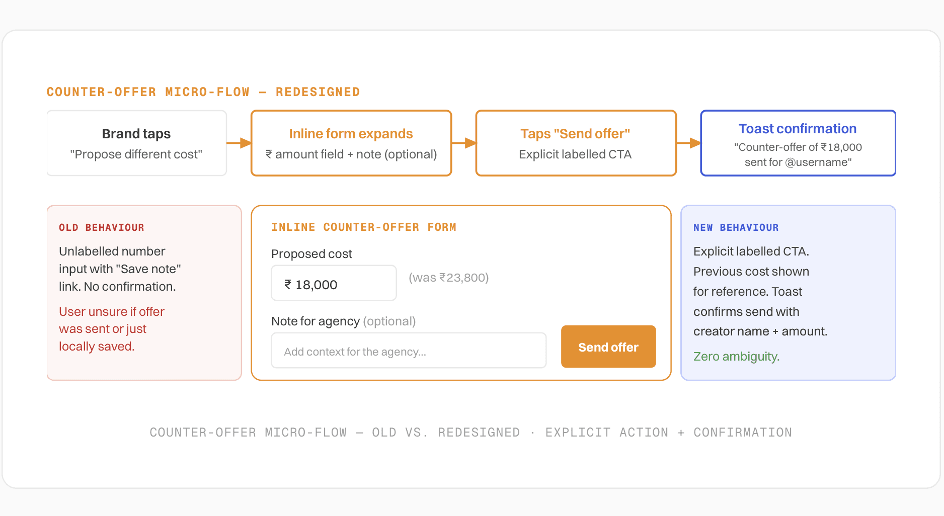
Counter-offer has no visible action or confirmation: Each card showed an editable number pre-filled with the proposed cost, next to lowercase text "we are fine with this cost," plus "Save note" and "Clear note" links. It was entirely unclear whether editing the number constituted a counter-offer, whether "Save note" submitted anything, or whether nothing happened until Select/Reject was pressed.
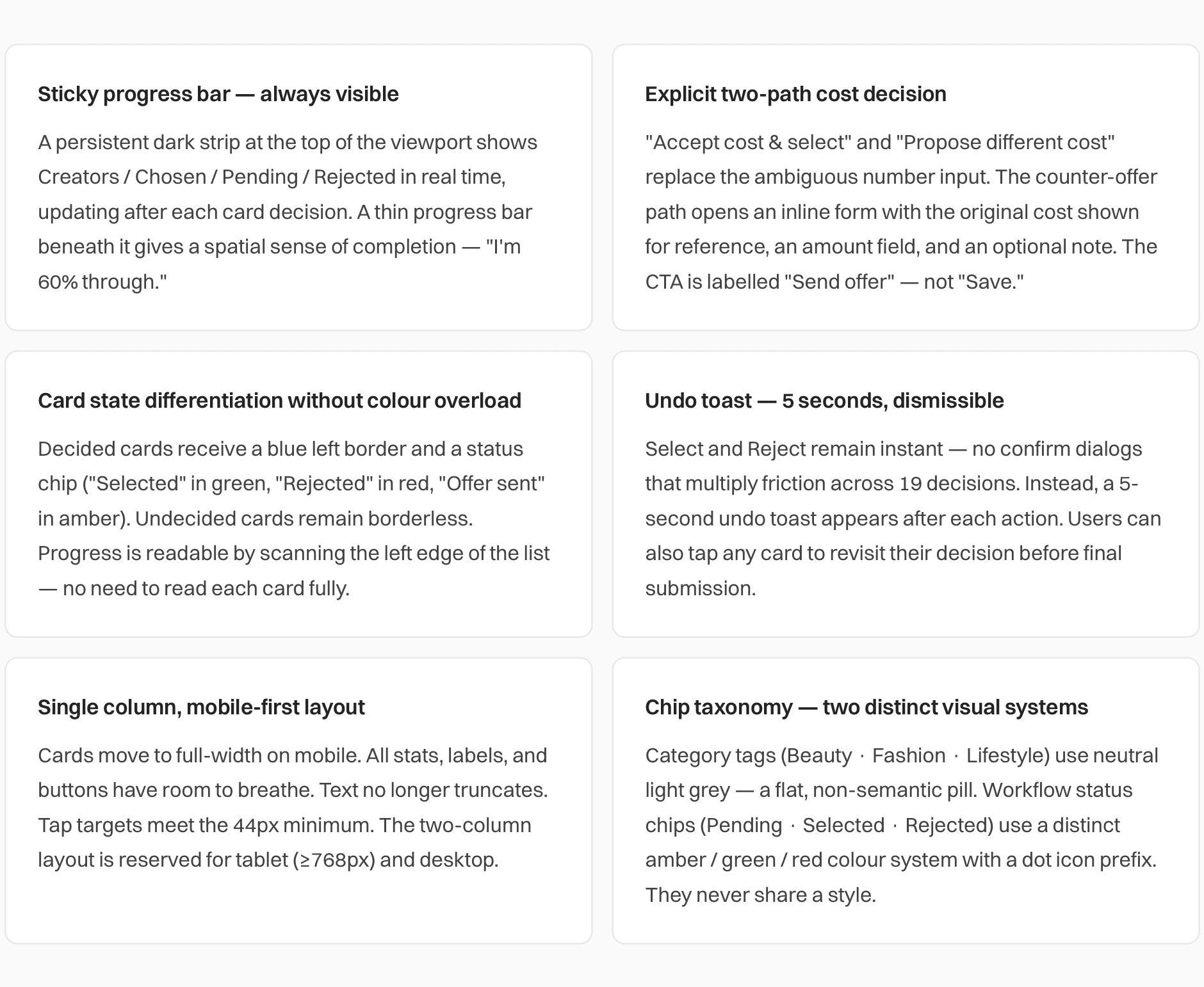
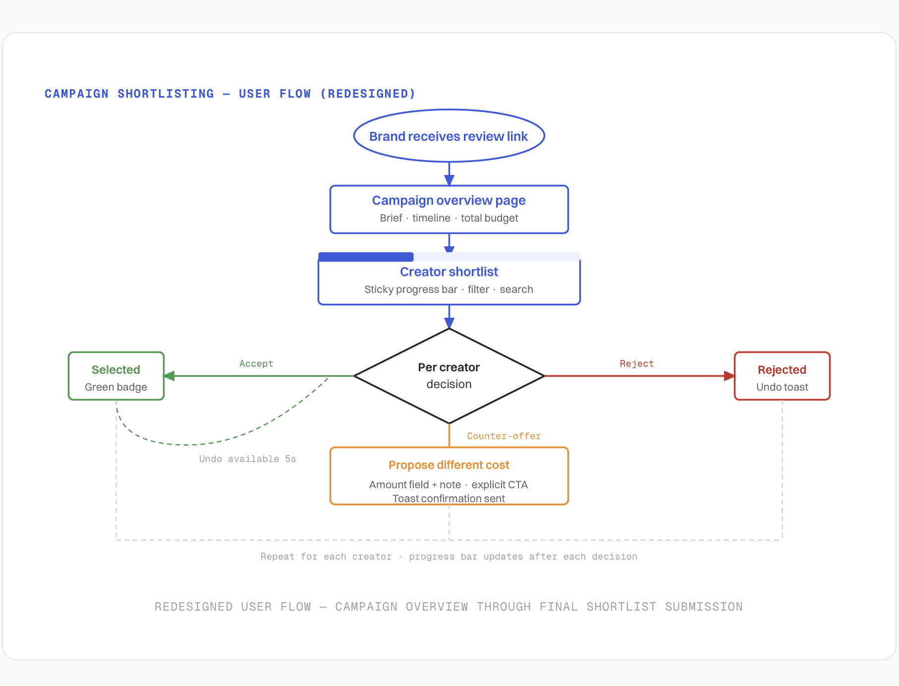
Recommendation: Separate "accept proposed cost" from "propose a different cost" into two explicit, named actions. Show a toast confirmation when a counter-offer is sent: "Counter-offer of ₹18,000 sent for @username."
#2 - No Progress Visibility
Summary counts disappear after first scroll: The Creators / Chosen / Pending / Rejected summary appeared only once, at the very top of a long scrolling list. A user 12 cards deep had no idea how many decisions remained — and decided and undecided cards looked visually identical.
Recommendation: Sticky progress bar persists throughout scroll. Each card receives a clear decided / pending state: distinct border colour, status badge, and icon — not colour alone.
#3 - No Bulk Actions
Every action scoped to one card: There was no way to act on multiple creators sharing the same status or filter result. For a repetitive multi-item review task, this multiplied effort by number of cards with no relief for experienced or time-pressed users — a direct violation of Nielsen's flexibility and efficiency heuristic.
Recommendation: Lightweight bulk actions scoped to the current filter view: "Select all shown," "Clear all decisions." A confirmation step before applying to prevent slips.
High Priority Issues [P1]
#4 - Wasted Header
Campaign title duplicated as heading and subheading: Client name appeared twice, identically, as both the heading and the subheading directly beneath it — wasting the most prominent orienting space on the page and reading as a bug.
Recommendation: Replace the subheading with distinguishing context: client name, campaign date range, and current status.
#5 - Orphaned Control
"Apply filter" button visually disconnected from filter fields: The Apply filter button sat right-aligned with a large visual gap between it and the filter fields above, breaking the spatial association between the fields and the action that applies them.
Recommendation: Place Apply directly below the filter fields, full-width or clearly grouped with them. On mobile, full-width is strongly preferred.
#6 - No Recovery Path
Select and Reject apply instantly with no undo: The page stated selections "become read-only after final submission," yet Select and Reject applied instantly with no undo affordance, no confirmation, and equal visual weight — making touchscreen slips on 19 stacked cards easy and unrecoverable.
Recommendation: Keep the action instant (no confirm dialog — that adds friction to 19 cards). Show a brief, dismissible 5-second "Undo" toast after each action. Users can revisit any card until final submission.
#7 - Inconsistent Data
Currency formatted at top, raw numbers inside cards: The top summary used formatted currency (₹35,000 with comma separator), while the same cost inside each card showed raw unformatted numbers (e.g., "23800") — adding visual noise and slowing cost comparison across all the cards.
Recommendation: Format every currency value consistently throughout. Format on blur, raw on focus for editable inputs if needed.
Medium Priority Issues [P2/P3]
#8 - Layout Density
Two-column card grid on mobile — text truncates mid-word: Each card held an avatar, 4 stats, category tags, an accordion, a cost control, a note field, and two buttons — all squeezed into roughly half a mobile screen width. "Engagement" broke mid-word. Tap targets shrank. Comparing creators side-by-side wasn't actually useful at this density.
Recommendation: Single column on mobile. Reserve two or three columns for tablet and desktop widths where each card has room to breathe.
#9 - Chip Semantics
Data freshness badges and workflow status chips look identical: "Recent posts" (data quality) and "Pending" (workflow state) used the same chip styling, creating ambiguity about what each chip communicated. The category tags also reused the same green as the Select button, diluting the semantic value of green = positive.
Recommendation: Visually differentiate metadata chips from workflow-status chips by shape, icon, and placement. Use neutral grey for category tags.
Design decisions
The redesign addressed all ten issues, with the highest design investment on the three P0 problems. The counter-offer flow, the most critical and most broken interaction, received a complete rethink.
Redesigned campaign shortlisting flow
Creator card — Before vs After

The counter-offer micro-flow
The most critical redesign decision was separating the cost-negotiation interaction into an explicit, named path. The old unlabelled number input sent no confirmation and offered no way for the user to know if their counter-offer had been transmitted. The new flow is a three-step inline interaction — trigger, compose, confirm — with a toast that names the creator and the amount.
Outcome
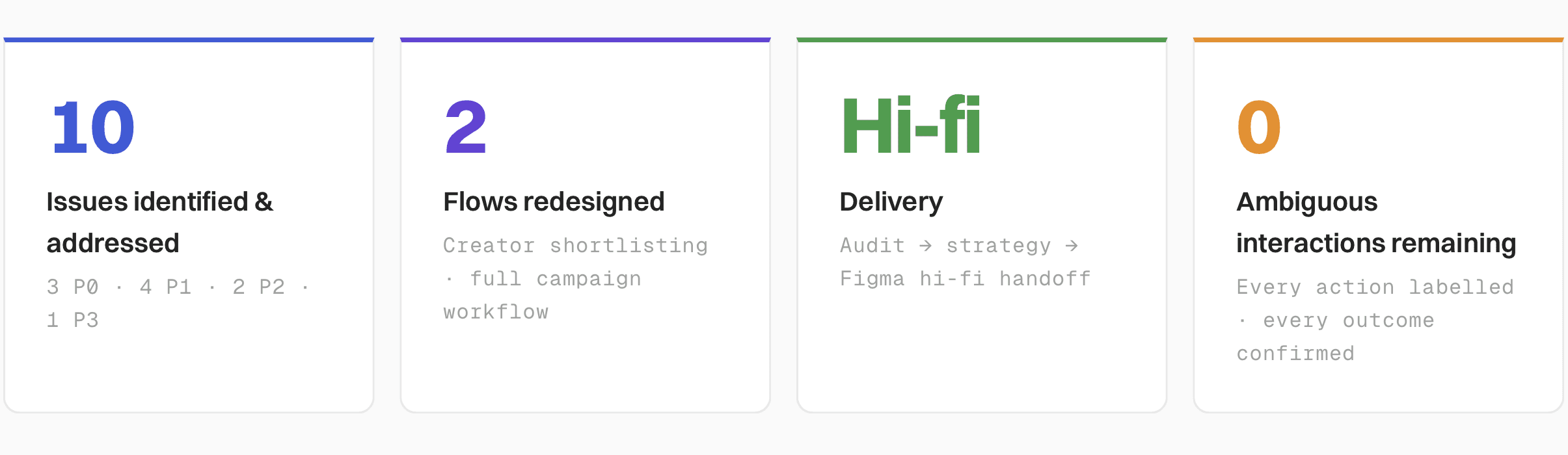
What the redesign resolved:
The counter-offer flow — the platform's most important negotiation mechanic — went from ambiguous to unambiguous: two named paths, one clear CTA, one confirmation toast.
Brand contacts can now track their progress through 19 creators without scrolling back to the top — the sticky progress bar updates in real time.
Accidental rejects now have a 5-second recovery path — the most common touchscreen error on a long mobile list is no longer unrecoverable.
The card layout on mobile went from a cramped two-column grid with mid-word truncation to a single full-width column with readable stats and reachable tap targets.
Chip semantics were separated — category metadata and workflow status now use distinct visual languages and no longer share colour with action buttons.
What I'd carry forward