Unified Member Dashboard
Company
A leading SaaS provider
Year
2025
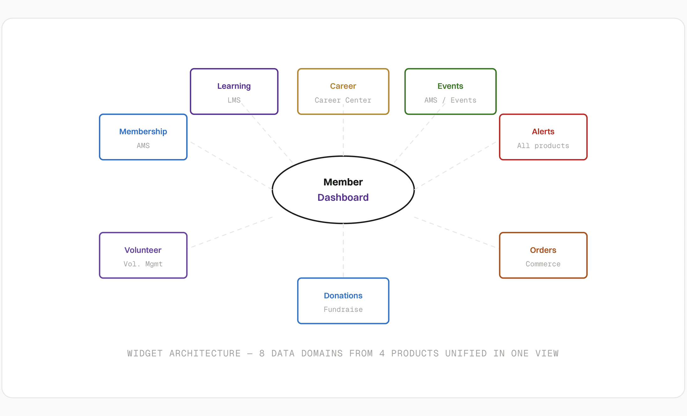
A leading SaaS provider serving nonprofits and associations through their products — Majorly AMS, LMS, Career Center, and Volunteer Management for this particular project. Members had no unified home. To check their membership status, course progress, job applications, events, orders, donations, and volunteer hours, they navigated each product separately. I designed and shipped a unified Member Dashboard that consolidated all the different data domains into one admin-configurable, role-aware view — giving members a personalised hub and admins a member health overview without leaving the platform.
Scope of Work
Problem Statement
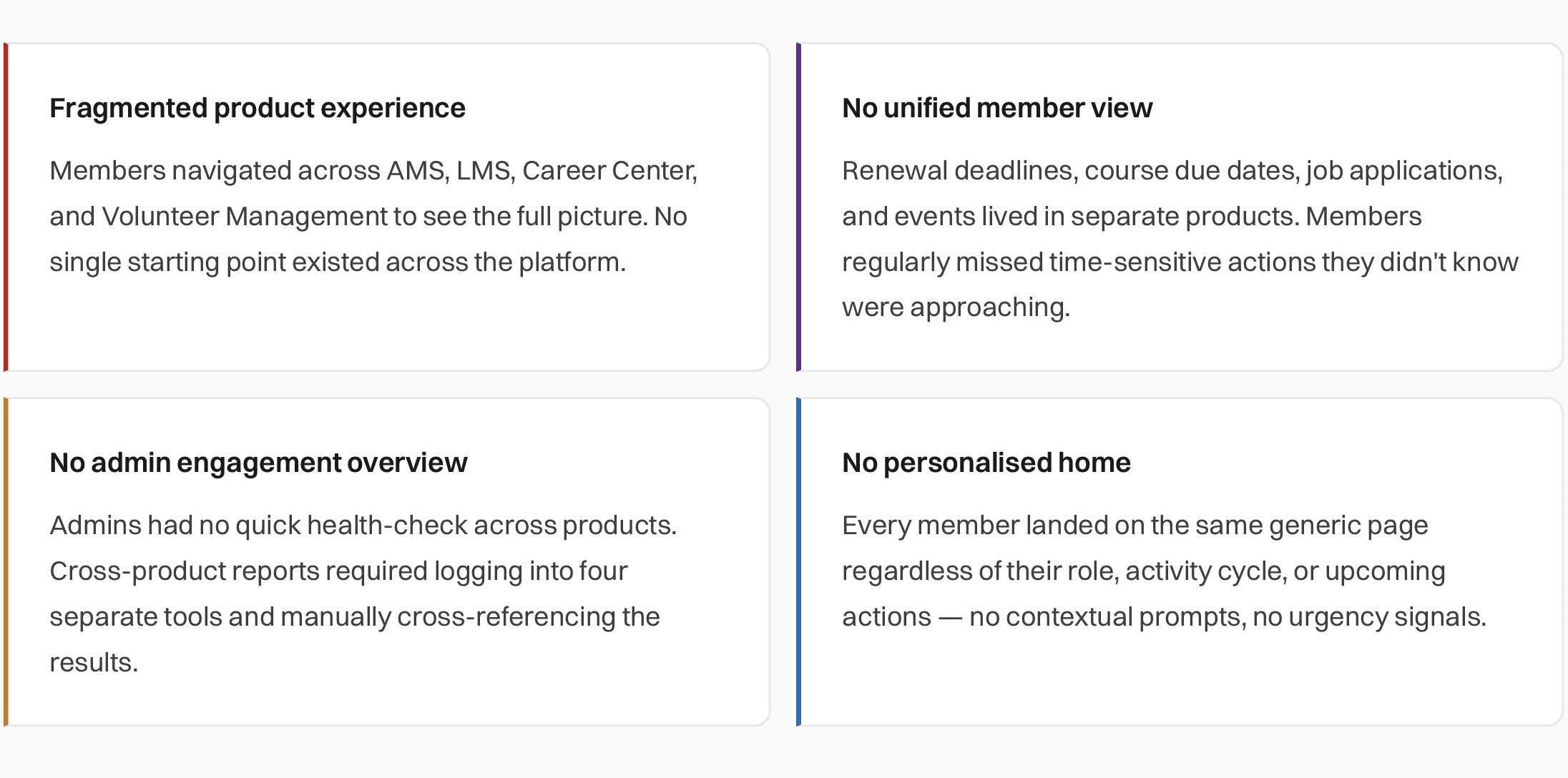
Multiple products, zero unified view: Before this initiative, there was no single home page reflecting a member's full activity. Every product was self-contained. Both members and admins lost time to navigation that could have been spent on actual work.
Research & Discovery
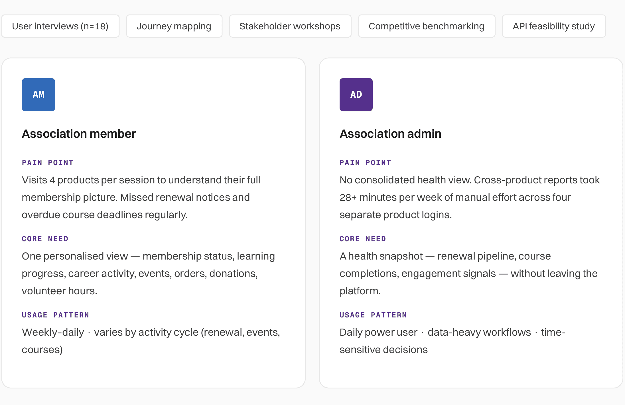
This project served two fundamentally different audiences. I ran research with both groups from the start rather than treating admin needs as secondary.
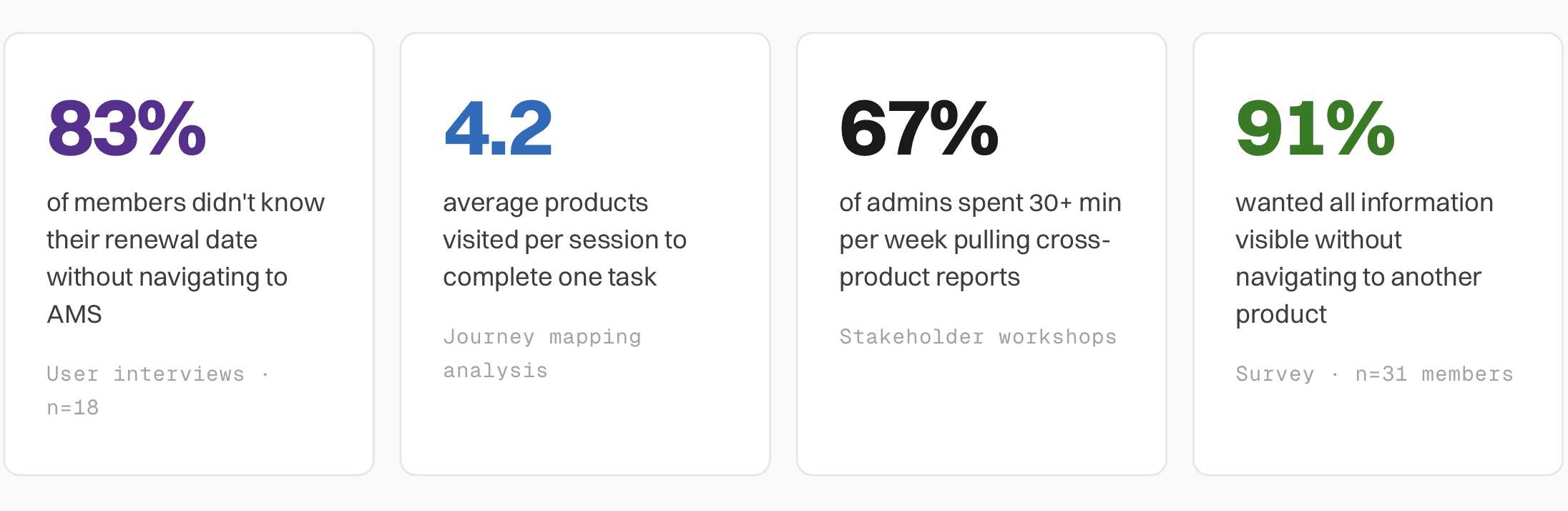
Key research insights
How might we give members a personalised, at-a-glance view of their full association life — and give admins the engagement signals they need — without requiring either group to navigate between four products?
Define
Mapping 8 data domains to widgets: Before wireframing I ran a widget taxonomy exercise — mapping each domain to its source product, data availability (real-time vs. cached), and the single most critical information a member needs at a glance. This seeded early API feasibility conversations with engineering.
Design Process
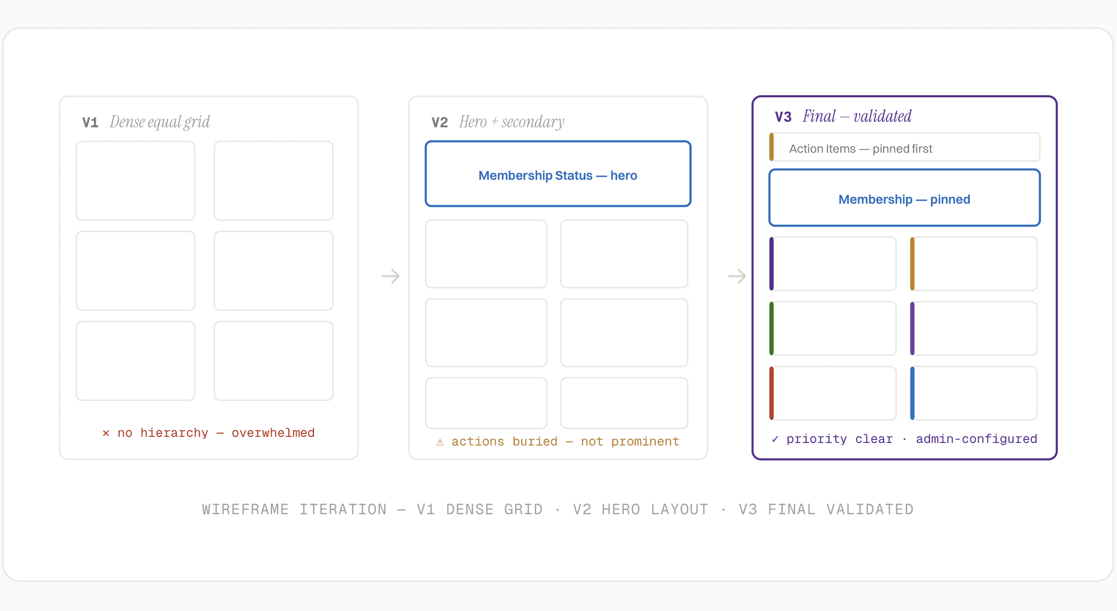
Three rounds of wireframes and testing: The central challenge was information density — 8 widgets competing for a single screen. Each round tested a progressively more opinionated hierarchy until the right priority order emerged.
v1: Dense equal grid
What was tested: All 8 widgets in equal-sized cards — a uniform grid with no visual hierarchy. Every widget competed equally for attention.
Feedback: Information overload. Members felt overwhelmed and couldn't identify what needed attention. Admins said it felt like a reporting tool, not an action surface.
v2: Hero + secondary
What was tested: Membership Status as a large hero card at the top. Remaining widgets in a 2-column grid below. Alerts moved to a right-hand sidebar.
Feedback: Much cleaner. But admins needed more data density, and members wanted "next actions" surfaced more prominently — not buried inside widget cards.
v3: Final — validated
What was tested: Admin-configured widget order. "Action Items" strip pinned at the very top. Membership Status and Alerts always pinned. Remaining 6 widgets in a responsive 2-column grid below.
Feedback: Members immediately understood what needed attention. Admins praised the health summary layout. Both groups completed tasks significantly faster in testing.
Final Design
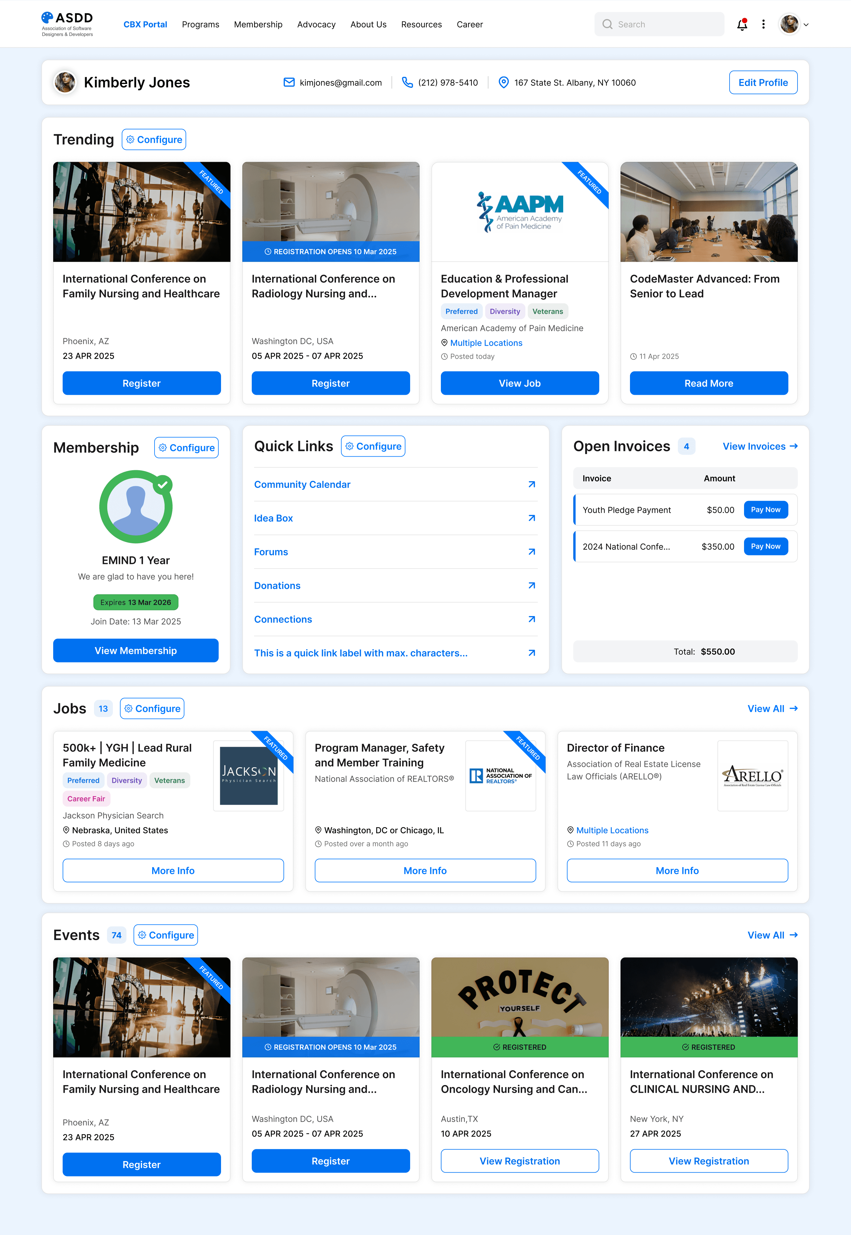
The final member view opens with a personalised greeting with membership status, a pinned Action Items strip surfacing urgent tasks, a hero Membership details stripe, and multiple domain widgets in an admin-configured grid layout.
How admins configure it
Overall page level
Admins control widget visibility and display order through a configuration drawer/Panel. The configuration is only accessible to the admins ensuring critical information survives any configuration.

Individual widget level
Each widget can be separately configured as well. Example - Membership widget, where each component of the Membership widget can be configured to exactly present certain aspects of the total information fetched from the central data-hub.

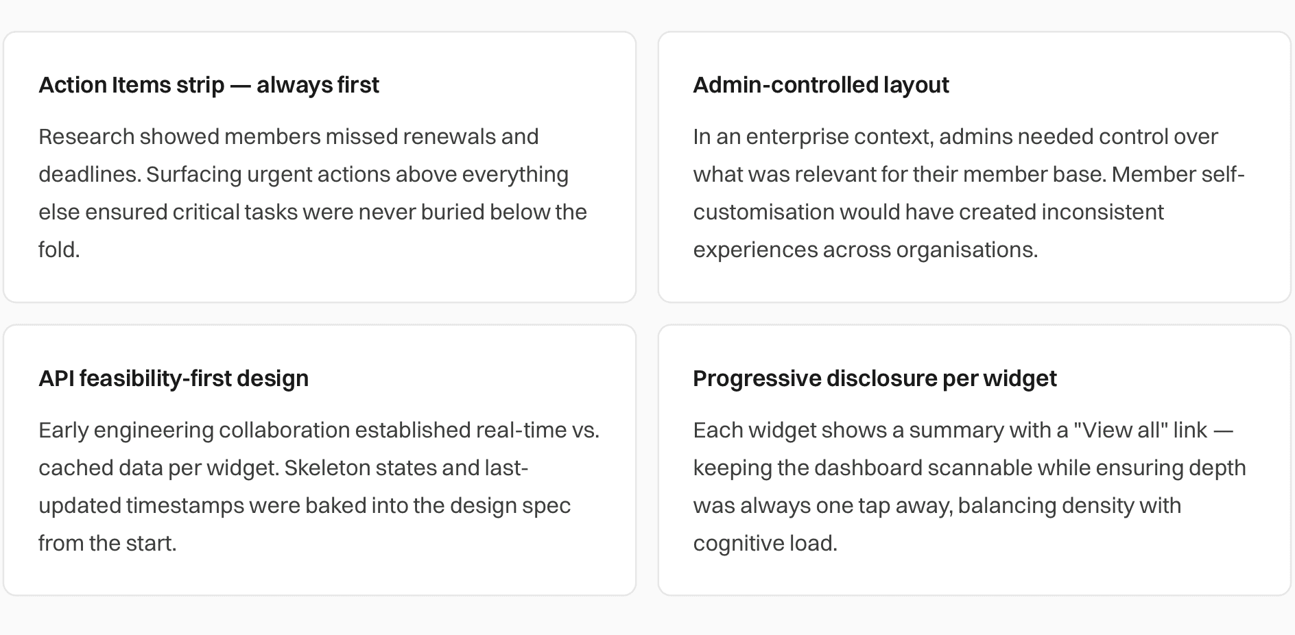
Design decisions and rationale
Outcomes and Impact
Results after launch
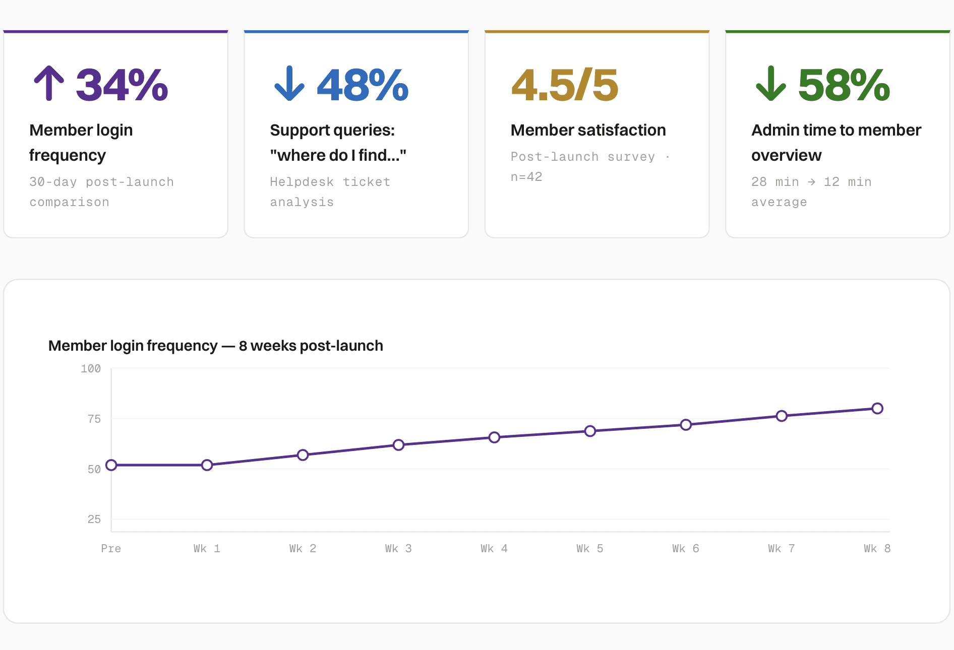
Qualitative outcomes
Members described feeling "more in control" of their association life in post-launch interviews.
Action strip drove timely membership renewals — visible reminders measurably reduced lapsed memberships.
Admins reported the health overview eliminated their weekly manual cross-product report entirely.
Dashboard positioned as a flagship differentiator in product sales demos and onboarding presentations.
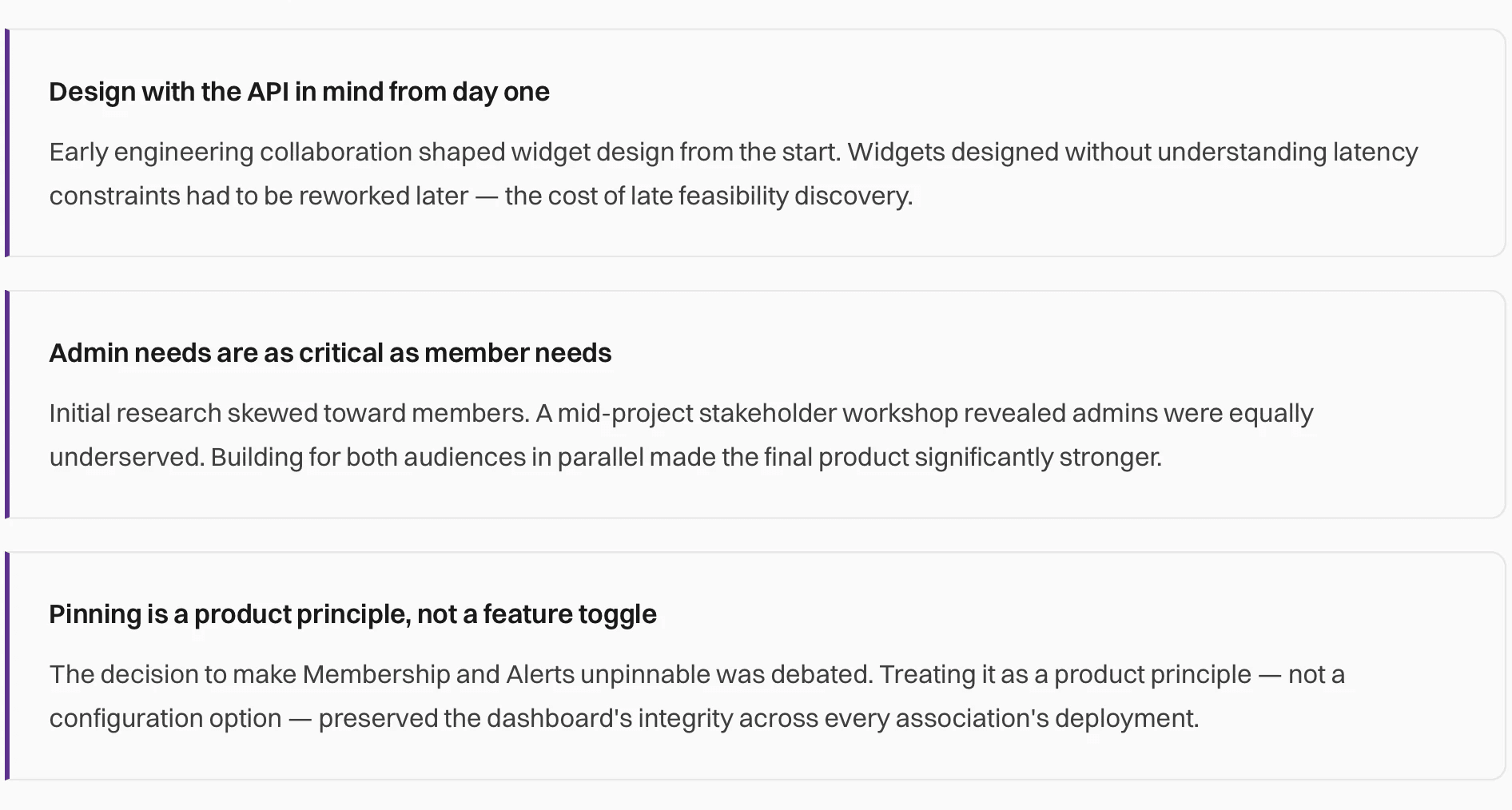
Engineering noted the widget API pattern accelerated future widget development significantly.
What I'd carry forward